Photoshop Learning Experience
|
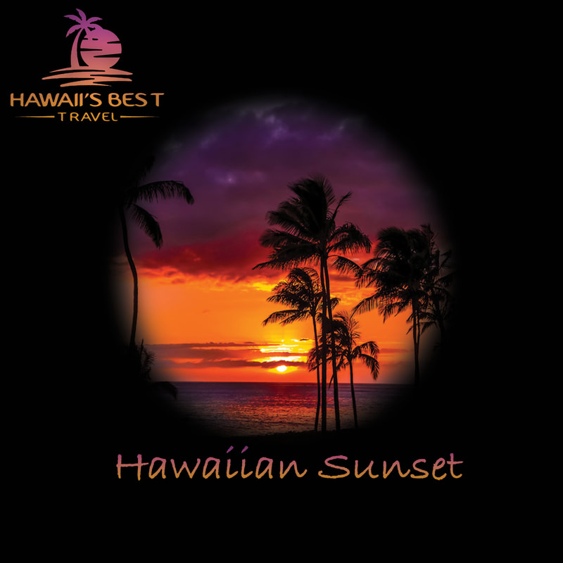
This was my first attempted/learning experience with photoshop. I chose this photo after scrolling through the graphic design website and coming across it. I felt it looked nice for what ever we would be doing with photoshop. It was a nice sunset in Hawaii so I made it a travel advertisement to come to Hawaii. I first filled the background with black and used the marquee tool with a bit of feather to make the picture more interesting. I then added text to it and stamped the logo ion the top left. To top it off I copied the layout of the text colours which matched the sun set and placed it of both layers with texts to give it a theme.
|
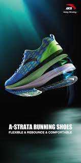
Shoe Advertisement inspiration
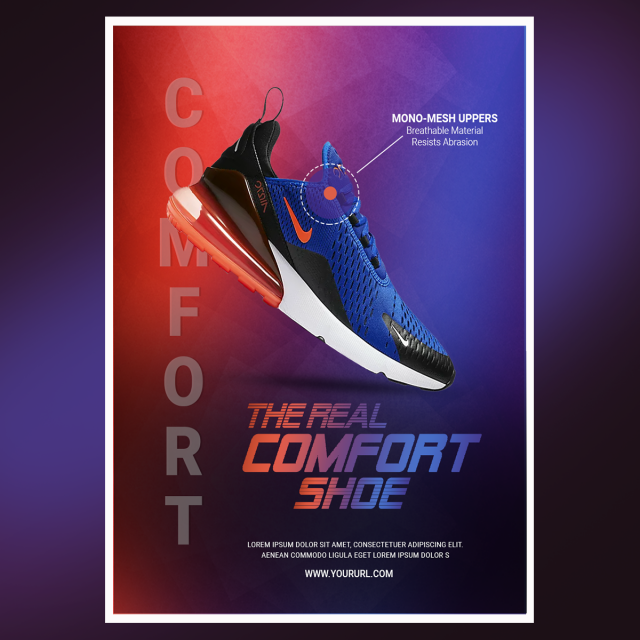
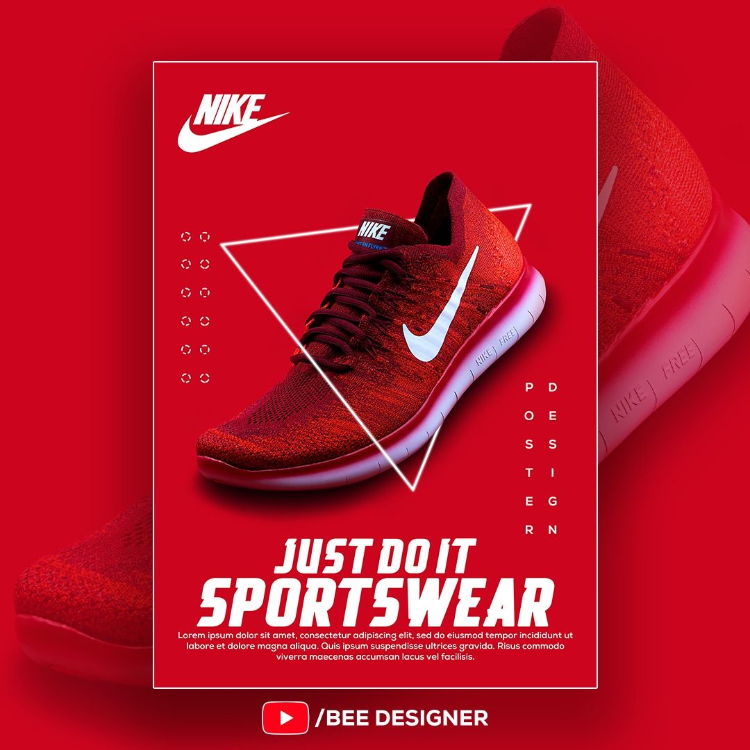
Practice Shoe Advertisement
|
This practice shoe assignment was a total fluke, I'm going to be completely honest, this was a great accident that Aleks and I managed to accomplish. We found a nice picture of a man sitting with his leg hanging to get a perfect background to take out of the image. We then brought it into photoshop where we then removed the background. We added a rectangle at the bottom of our black background and put a mask over the shoe. We took a paint brush and brushed over the mask as a joke and I think accidentally touched some type of blend mode, because the she then looked like that, we automatically resized it looked good, so we added paint splatters in the background and made it the theme. We added a logo, slogan, and the information which also has paint on it to finish it off. |
|
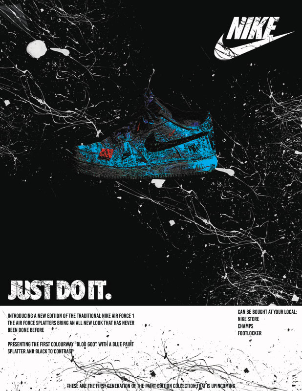
Shoe Advertisement
|
This is my shoe advertisement, I don't know how but my practice one looks better than my "good shoe advertisement, no matter, it still looks ok. Well, this one was an attempted to get the shoes to look as if they are floating or give them a light feel when you look at them, I'll let you be the judge of that. I started the same way as my practise shoe, took the background out, made the rectangle, then instead of paint I went with some smoke. At first the smoke was white and the back ground was dark, but since the shoes were black I thought it would be better if the background was light and the smoke was dark, so thats what I did. It looks better, trust me. I tried to make the smoke symmetrical like they were attracted and swirling toward and around the shoes. I ended it by adding the logo and slogan with patterns inside them with white outlines to make them stand out with the information at the bottom in the small rectangle. I then added Big Chungus as out mascot because is you trust a product that can make a bunny that is that fat feel light, then they will certainly make you feel light... Right? |
Halloween Movie Poster
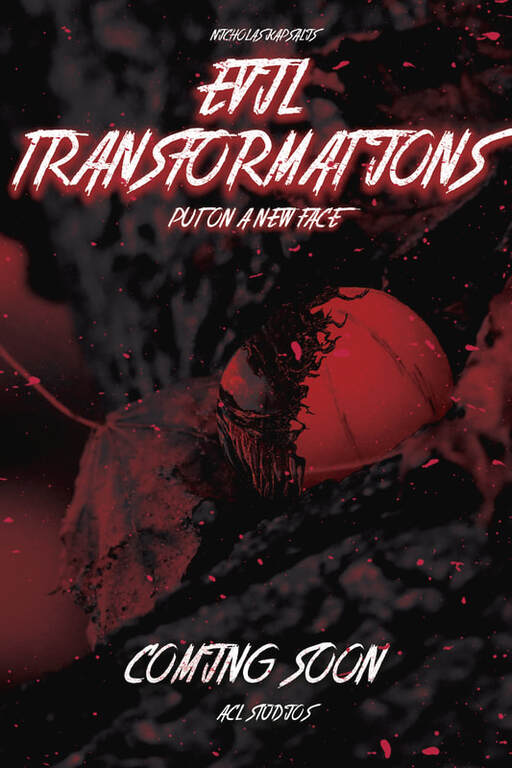
The movie poster I decided to make was a horror one Inspired by the movie Venom. By using half of venom's face, I was able to make my fake pumpkin look very evil. Since I've watched the movie Venom, I know that Venom can transform and become different things, I was inspired to make the title have to do with that. I made this by creating a cut out of the orange and clipped the venom face to the orange so it would only show up in the orange. I then duplicated the background layer and changed the balance to linear darken to make the whole thing look evil. I added the title with a spooky colour for the drop shadow, added paint / blood splatters, and made the studio that made this movie called ACL studios because my ACL was torn during the process of making this poster.
|
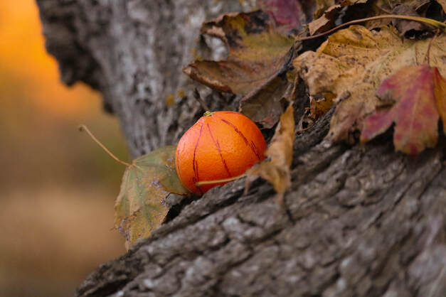
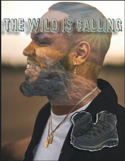
I explain this photo in my light room pictures, I just put it here as well so that you can compare this picture to the movie poster.
|
Clipping layers